Sister knows best! Let’s go!
Sister Airlines is a new air service that provides solutions for all US-domestic travelers by way of low-cost and easily digestible information for ease of booking. In lieu of travel discrepancies we have all faced, Sister Air looks to create opportunities for users to get things right the first time — because nobody likes to be halfway across the country with doubts of their travel plans. Sister knows best — let’s go!
Contribution: UX/UI Design, UX Research, Branding, Prototyping, Usability Testing
Tools Used: Figma, Adobe Illustrator
Duration: 4 weeks
The Problem
Given that Sister Airlines is a brand new airport booking website, it will need to stand out from it’s current competitors. Users have expressed that among all airline websites, booking a flight for more than one passenger is a tedious process with high risk of getting tied up in small details and later discovering bigger mistakes.
The Solution
Sister Airlines gives a simple, easily clickable and intuitive UI. Users have asked for clear information -- this has been granted by way of white space between important details to ensure users can comfortably find information that is critical to their flight.
User Interviews
We wanted to know — so we asked. We interviewed 7 participants to better understand what their experiences and pains are with booking flights online. Our data was then shortened into 7 individual customer problem statements to quickly express how our users are feeling about current processes in the flight booking world.
Frustrations
We’ve discovered that most users are weary about confusing details and unnecessary steps. Travelers prefer to not guess on any details but are sometimes distracted by upgrades and pop-ups.
Motivations
Users have shared with us that their information is sacred to them and prefer no mistakes during their processes — avoiding confusion seems to be the #1 trend among semi-frequent to frequent travelers.
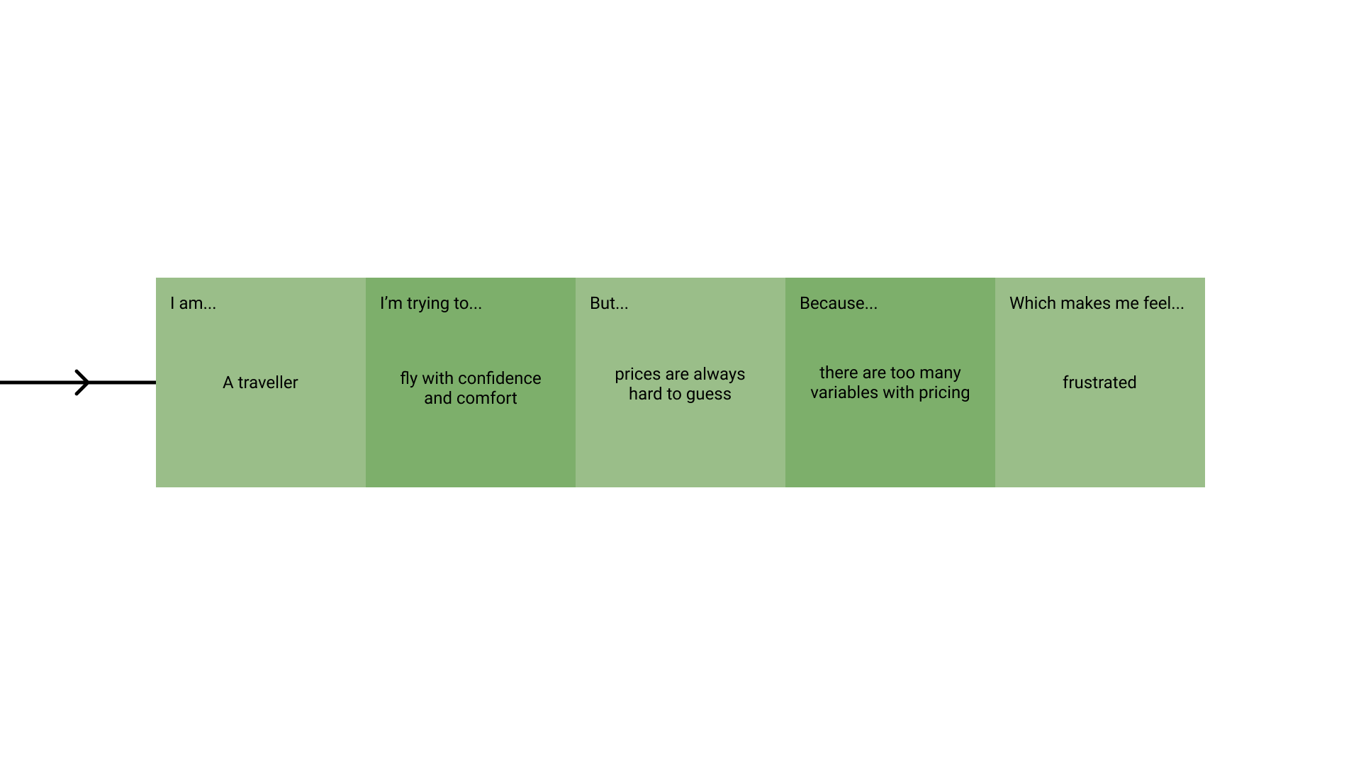
Lo and behold..
Based on research found in our user interviews, we’ve built our first customer problem statement. Our users have introduced a trend in pricing clarity — this will reinforce things being easier to understand while booking group travel.
Site Map
In our secondary research, we looked into direct competitors to Sister Airlines. We were able to note popular trends in website navigation styles from companies who have proven revenue success. In case our users get lost, they will refer to this navigation menu.
The Task Flow
Based on a combination of information clarity and the future of travel, a task flow was created to help users get users easily onto the plane. Our task flow was inspired by direct competitors and will feel very familiar to users with previously learned behavior as well as cater to those who are new to flying.
Branding
In order to properly communicate the company’s attributes, an official logo was created. We developed attributes/key words to help give direction to the branding of Sister Airlines. These words are: friendly, family, loyal, sincere and playful. After carefully imagining each of these graphics on the sides of airplanes and as backdrops for terminals, we chose our winner — #11.
The Color Palette
In today’s times, colors tend to help with visual-aid and emotional attraction. Sister Airlines aims to be easy on the eye and attractive to users of all ages and demographics. To better pinpoint this direction, we used the following key adjectives for inspiration —
Family
Friendly
Loyal
Sincere
Playful
Our goal for this color palette was to create a lasting impression on our users and help them feel at ease with the navigation. We would like to build loyalty and give users a place to feel welcome without an overwhelming experience.
Usability Testing
We conducted our usability testing with the following demographic for participants:
6 users
Ages 21-55
Has booked a flight online and travelled by air within last 2 years
Usability testing was conducted via Zoom calls for varied durations of 12-20 minute calls. Users were instructed to perform our main task flow and provide feedback using a Think-Aloud method to pinpoint any priority revisions to be made in future steps.
Affinity Map
Proceeding usability testing, we compiled our information into categories relating in similarity via affinity mapping. This method allowed us to view insights based on majority preference. These preferences made by users revealed recommendations to serve as a guide for priority revisions.
We’ve noticed that users seem comfortable using a single flyer flow and did not have issues utilizing the new feature. UI issues arose during usability testing, which serve to be very important for us to address.
The Experience
The overall look and feel of Sister Airlines gives intentional references to mental models within our users. A familiar Find-dates form allows users to search for desired airports and flight dates within SA.
To address users who wish for a better experience with booking group travel, the group travel feature has been introduced — this feature allows users to send a link to their travel buddies to fill our their share of the forms.
In further pursuit of a solid user experience, our users will be prompted to call on their travel buddies to properly pay their shares before finalizing the checkout process by using an invite to pay feature. For our generous users, we have also included a feature to let a single user pay for their trip in full.


