Sister knows best! Let’s go!
Sister Airlines is a new air service that provides solutions for all US-domestic travelers by way of low-cost and easily digestible information for ease of booking. In lieu of travel discrepancies we have all faced, Sister Air looks to create opportunities for users to get things right the first time — because nobody likes to be halfway across the country with doubts of their travel plans. Sister knows best — let’s go!
Project: End-to-end Mobile Application for iOS
Contribution: UX/UI Design, UX Research, Branding, Prototyping, Usability Testing
Tools Used: Figma, Adobe Illustrator
Duration: 4 weeks
The Problem
Given that Sister Airlines is a brand new airport booking mobile application, it will need to stand out from it’s current competitors. Users have expressed that among all airline applications, booking a flight for more than one passenger is a tedious process with high risk of getting tied up in small details and later discovering bigger mistakes.
The Solution
Sister Airlines keeps the group travel spirit alive with those who believe in “the more -- the merrier.” Our mobile application features a group-booking function intended to make your experience with booking flights easier for those who like to send their research team to a quick weekend conference!
Sister Airlines’ new Group-Booking feature!
Secondary Research
Using previous secondary research (see Sister Airlines Desktop Case Study) to discover user pains, needs and interests, a very interesting detail was discovered -- one user donated the idea to make group booking a much easier process. But how could it be done?
User Data had been collected via secondary research and previous usability testing. This data served very valuable to not disturb the current flow from the Desktop Website. At this point, the Sister Airlines UI had to be translated to a mobile format -- especially for our users on the go.
The Task Flow
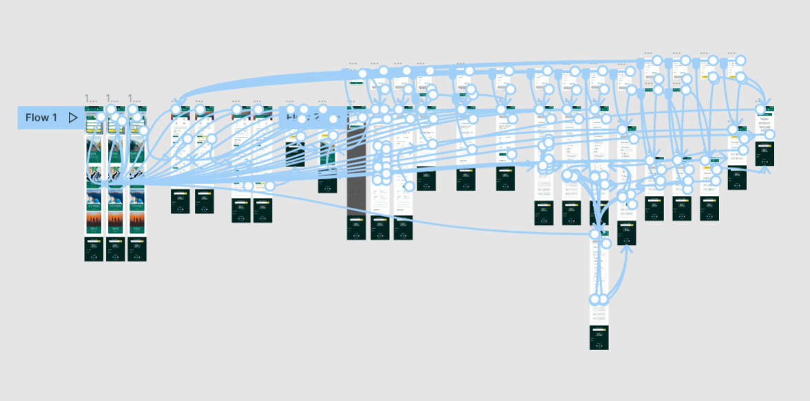
In my prior secondary research, I have also noted of some common flows for online flight booking within our competitors. This information led us to creating a proper Task Flow for our users to get through our first prototype, and a direction to work towards in the process.
This particular prototype needed to feature the original Single Flyer Flow as well as the Group-Booking feature. These two features will be seen separated from the beginning, but harmoniously similar for users who want to browse flights for the solo-traveler, or the big bachelorette weekend.
Wireframing & Prototyping
In my secondary research, we found trends within our competitors with successful revenue in regards to navigation and composition. The process began with creating desktop wireframes to inspire a consistency throughout the website.
The design of the desktop website directly inspired the mobile wireframe, where I anticipate our demographic will be looking at flights the most often.
Usability Testing
We conducted our usability testing with the following demographic for participants:
6 users
Ages 21-55
Has booked a flight online and travelled by air within last 2 years
Usability testing was conducted via Zoom calls for varied durations of 12-20 minute calls. Users were instructed to perform our main task flow and provide feedback using a Think-Aloud method to pinpoint any priority revisions to be made in future steps.
Affinity Map
Proceeding usability testing, we compiled our information into categories relating in similarity via affinity mapping. This method allowed us to view insights based on majority preference. These preferences made by users revealed recommendations to serve as a guide for priority revisions.
We’ve noticed that users seem comfortable using a group travel feature and did not have issues utilizing the new feature. UI issues arose during usability testing, which serve to be very important for us to address.
The Experience
The overall look and feel of Sister Airlines gives intentional references to mental models within our users. A familiar Find-dates form allows users to search for desired airports and flight dates within SA.
To address users who wish for a better experience with booking group travel, the group travel feature has been introduced — this feature allows users to send a link to their travel buddies to fill our their share of the forms.
In further pursuit of a solid user experience, our users will be prompted to call on their travel buddies to properly pay their shares before finalizing the checkout process by using an invite to pay feature. For our generous users, we have also included a feature to let a single user pay for their trip in full.


